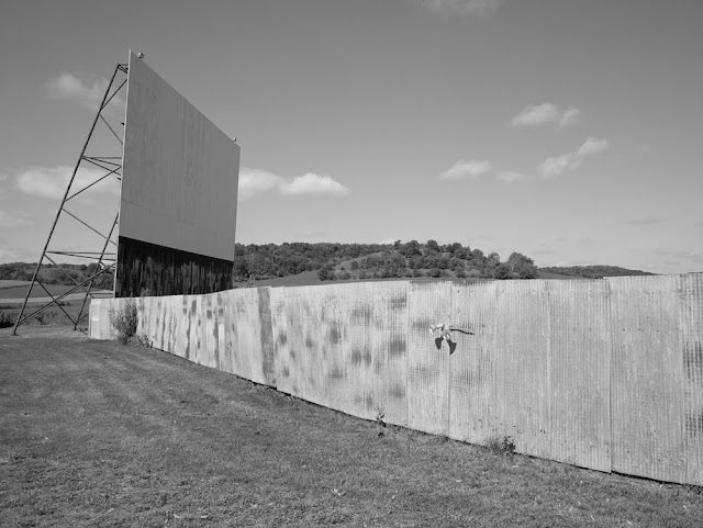
Richland Center, Wisconsin
Up until now I've never been happy with b&w conversions from digital capture. I was quite sure that the problem wasn't technical. It was, and remains, in my head. When I shoot with a digital capture camera I know I'm shooting color, so I shoot in color and if you strip the color away the picture's no good anymore. Simple. If I could talk my subconscious into thinking that I'm shooting b&w with a color camera, that would be great but it doesn't seem to work. However, there's such a thing as post-visualization.
When I arrived at The StarLite, I had not been able to make contact over the internet or phone beforehand. The theater sits at the back of a long drive, and at the front sat a very barred gate. With No Trespassing signs. All of it clearly visible from a busy four lane highway. Marching in with the Deardorff or the Korona seemed out of the question. But I did sneak in with my micro 4/3s digital camera, and made several pictures. I was particularly interested in the way the theater was surrounded by active farmland on three sides, with the highway on the fourth. I certainly would have made several 8x10 negatives if the intention to keep people out hadn't been so clear.
Thing is, these pictures convert wonderfully to b&w. In ACR I adjusted them as usual in color, then converted them with the HSL/grayscale panel. Opened them into Photoshop, did further adjustments with a curve, as I would from a scanned b&w negative. The pair of 13 inch wide prints are just fine, fitting in perfectly with the rest of my project. Which is enough to give one pause.
So then I went back and rejiggered the tonality of the files to look right on screen (WYSIWYG is a fantasy, even with color management and calibrations, a file adjusted to look nice on the web will make a lousy print, with harsh contrast and blocked shadows, while a file adjusted to print beautifully will look like a soft, pale, mess, online. Monochrome is even worse than color about this.
So, having worked off and on for a dozen years now on the Drive-in Theater project, either my head went directly to my usual b&w for the subject even though I was using a color digital camera, or, perhaps, as soon as I looked at color digital captures of this subject matter with the intent of converting to b&w, I had no trouble visualizing the transition. There must be a lesson to be learned from this, but I neither know exactly what it is, or whether it will take effect on me.
Richland Center, Wisconsin


4 comments:
Now, when you look at the digital b/w conversions in these two cases, does your eye still tell you immediately that they started out as Bayer digital? What would happen if you also converted some of your m4/3 cover shots, taken while or just after you were shooting that scenes on b/w film?
scott
Scott, if I look closely at 13 inch wide prints I can tell that they are not from large format, though they are at least equal in detail to medium format film. Nothing particularly leaps out as saying "Bayer array." Your second point actually happened first. I tried a conversion of one of my digital captures, and this is where the post-visualization comes in. I think I'm so used to working with this subject matter in b&w that I could easily make the mental adjustment to converting the color capture. It didn't look "wrong" with the color stripped away.
Since I do not do prints (something I save for my retirement, ;-)) - perhaps out of fear of the issues you mentioned in the post - I can only say that I see b/w. After reading your post I looked around and could instantly switch to b/w. Looked out of my window and saw the b/w photo. Looked around in my office and saw b/w frames.
Usually I am good at predicting which photo will be a b/w and which one a coloured one - all the time shooting in colour of course. It's hard to explain. I guess I am mentally adjusted, grin.
With the FF I have the problem with blocked shadows more often than before. Not sure what to do about it - am trying things. And I am only talking about web ;-).
"The pair of 13 inch wide prints are just fine, fitting in perfectly with the rest of my project" ....that's a remarkable observation but one that I could concur with from my own experience. I generally prefer even smaller prints and "why do I need my Canon and a raft of L lenses" is frequently on my mind. The Canon caused me to divest of the last of my film gear, an Ebony field camera, just last year, and now I'm questioning the Canon! I agree totally about "post visualization" and thought your recent post on the subject was spot on. Pre-visualization just doesn't work for me!
Post a Comment